Mobile-First Web Design: Why Your Site is Slow on Phones

Introduction
In 2026, mobile-first web design won’t just be a trend. It will be essential for any brand wanting to thrive online. Google now uses mobile-first indexing. This indicates that your website’s mobile version is the primary one. It determines your ranking in search results. This is how mobile-first indexing operates. A slow or clunky mobile experience drives away users. It also hurts your global visibility online.
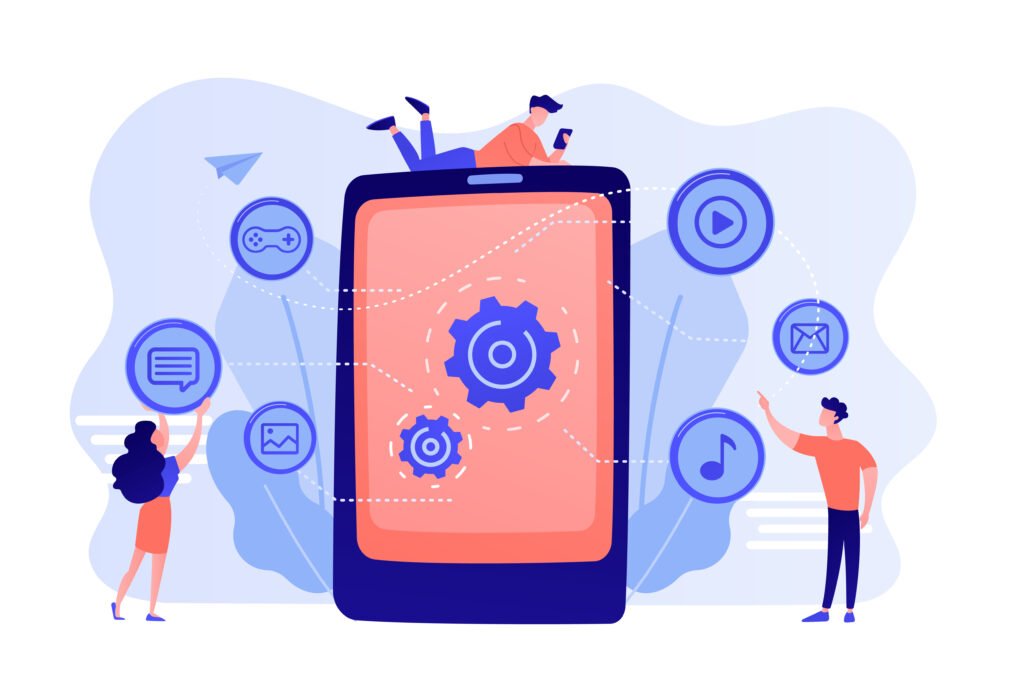
The “Mobile-First” era of web design means you should first focus on how your site appears on a smartphone. Then, consider how it will resize for a desktop. Using the right speed and touch-friendly layouts boosts mobile traffic. This, in turn, increases the chances of making sales.
Why Your Site is Slow: The Technical Pitfalls

Bad speed is a problem many sites face in 2026. Most were designed for desktops first and then made smaller for mobile devices. Sites built this way carry heavy technical baggage, known as “heavy resources.” This includes high-resolution images and complex code scripts. Desktops manage these well, but smartphones struggle with them. When a smartphone loads a web page with “heavy resources,” the browser pauses. It focuses on downloading these resources. This causes the annoying “white screen” until the download is done.
To pass Google’s Core Web Vitals, you must fix these slow points. Compress the images on your site if you haven’t yet. Use modern formats like WebP or AVIF. They can cut file sizes by 80% or more, while keeping quality intact. Minimizing code bloat is key for a fast-loading site, especially with Mobile First Web Design. This means removing unused plug-ins and third-party scripts. This will provide a better experience when used over slower 4G or 5G connections.
|
Element |
Desktop-First Approach (The “Slow” Way) | Mobile-First Web Design (The “Fast” Way) |
|
Images |
High-res JPEGs scaled down by CSS. | WebP/AVIF formats with lazy loading. |
|
Code |
Bulky Frameworks & unused JavaScript. |
Minified CSS and prioritized critical paths. |
| Server | Standard hosting near HQ. |
Edge Computing and CDN delivery. |
| Navigation | Complex hover-dropdown menus. |
Simplified “Hamburger” or Tab-bar menus. |
Mobile-First Web Design and the SEO Connection

Google is refining its algorithms. By 2026, the standard will be the “Smartphone Bot.” Google’s Mobile-First Indexing now focuses on mobile sites, not desktop ones. This means Google will look at your mobile site to decide your ranking. Your rank will drop on all devices, including desktop, if your mobile site is hard to use. This also happens if it has broken links or is missing key items.
The 3-Second Bounce: A Key Indicator of SEO Success
SEO has shifted. It now emphasizes keeping users instead of just finding keywords. Google examines user engagement metrics to assess the quality of your website. If a user clicks on your website and then bounces in under 3 seconds, Google determines that you have provided an unsatisfactory result.
- The Law: Websites that take longer than 3 seconds to load on a mobile connection will have a 53% abandonment rate.
- The Effect: A high bounce rate negatively impacts your search rankings. Google sees quick exits from your site as a sign that your content is irrelevant or your site isn’t performing well.
Technical Alignment: Content Parity
One big mistake web developers make is hiding extra text or images to save space on mobile devices. In 2026, if that content isn’t accessible to a mobile bot, it won’t exist for search engines from an SEO viewpoint. Mobile-First Web Design makes sure all your “hidden” data, like accordions and tabs, gets crawled and indexed by search engines. first web design This helps you keep your topical authority.
Conversion Engineering – Taking Browsers and Converting Them to Buyers

In 2026, Mobile-First Web Design will be the top tool for “conversion engineering.” Mobile traffic is high. However, sales often don’t happen. This is due to many obstacles between browsing and buying on a small device. To turn more browsers into buyers, focus on Mobile-first Conversion Rate Optimization (CRO). Remove any obstacles that might block a prospect from making a purchase. The best way to make buying easy is to cut out “clutter.” Use white space wisely and design each part, from choosing a product to paying, so it can be done with one hand.
Simplifying the Mobile Path to Purchase
A strong mobile strategy reduces users’ ‘mental load.’ This helps create a website that converts better. Websites that convert well focus on finger-friendly buttons. These buttons should be at least 44×44 pixels. They also use ‘micro-interactions.’ For example, users might feel a small vibration when they tap a button or see a visual cue when they add an item to their cart. This gives users quick feedback.
- Keep your Mobile UI/UX simple. This way, users won’t feel lost or frustrated by overlapping text and elements.
- Frictionless Checkout: Use one-tap payment options like Apple Pay or Google Pay. This way, you won’t have to enter your card number manually in-store.
- Mobile-Friendly Forms: Floating labels and auto-completing address fields can cut shipping address entry time by up to 50%.
- Visual Hierarchy: Place your most important Call To Action (CTA) within the ‘natural thumb zone’, which will be located approximately at the bottom-middle of the screen.
Essential Checklist for Optimization

To do well in 2026, your mobile-first web design websites needs to be lean, agile, and functional. Media queries and Adaptive Design will help your layouts fit within the different screen sizes, however, the ones making the big changes are moving towards Progressive Web Applications (PWA) — sites that work and look like they belong on a device; the best part is they can be accessed offline, load at extremely fast speeds…
Here is a checklist you can use to verify your site is not only “responsive” but is also really optimized for your mobile audience.
“Speed First” Checklist
- Remove “Render-Blocking” JavaScript; you should put any non-essential script at the bottom of the page or use defer within your script tag; this will allow your page to display its content quickly.
- Use SVG images for your site’s icons; they are vector-based and will allow you to have clean, crisp, and at a resolution that does not rely on the number of pixels but will not take up much of your bandwidth.
- Implement Lazy Loading; only load images and videos when the user is scrolling down to them; this will reduce the amount of bandwidth used and increase your page’s speed (and therefore how quickly a user sees the page) to be displayed.
- Test on Slow 4G/LTE Networks; do not trust your office Wi-Fi; use the developer tools found in your web browser of your website to simulate slower 4G LTE speeds on a mobile device, as that is what the majority of mobile users are using;
Recent Trends – Dark Mode and Haptic Feedback
Mobile- first web design in 2026 is all about more than just how a website looks, but rather how it feels to be engaged with it, and how it saves energy when doing so. A key trend is optimizing pages with dark backgrounds for an OLED screen since the “true black” pixels on modern smartphones will actually turn off when using dark mode, which can save between 20-40% on battery usage, meaning users can spend longer browsing your site.
Pairing Dark Mode with Haptic UX (small vibrations that happen when you press a button) will help create a more “real” and engaging experience for users.
The Next Generation of AI Adaptive User Interface and Haptic UX
The next frontier is AI Adaptive User Interface, or AI Adapted Website User Interface (AI UUI), which will use your phone’s orientation and position in real-time to adjust the layout of your website. For example, if an AI recognizes that you are having trouble hitting a link, the AI could increase the size of the button you are trying to press or move the menu closer to where you are holding the phone. When combined with Haptic UX (small vibrations upon clicking), you’ll create an experience that is much more tactile and responsive to touch, even when using your phone with only one hand.
- Haptic user experience (UX): Haptic feedback (a subtle vibration) is used in high-end mobile-first web design to provide confirmation of an action (e.g., submitting a form or clicking “add to cart”) with a tactile way to say “thank you” and create a sense of trust without adding visual clutter.
- Trends:Interface accuracy:Over time, interfaces will learn the distance that my thumb has to reach in order to select primary buttons in my own personal “comfort zone.”
- Contextual themes: Modern websites automatically switch between dark mode depending on either the amount of light in the room from the ambient light sensor or based on the time of day, reducing eye strain.
Conclusion
In 2026, “shrinking” a desktop site to fit on a mobile device is no longer enough; mobile-first web design is now the only way to go. Mobile-first web design means building for the smallest screen first, then expanding to larger screens. This approach protects your search ranking and will help reduce the conversion gap. A site that feels like it was designed to be used with only fingers and provides immediate feedback creates trust, which is what you must do to convert visitors to customers. Don’t let an overly large desktop site hold your business back; contact AGTC for help with auditing your site’s mobile speed, or switch to a high-performance framework now!
You May also like
1. Web Development 2025: The Road to Digital Marketing
2. Web Development in USA: Essential for Your Business
3. How WordPress Development Complements Digital Marketing
4. How to Build a Successful E-Commerce Website in 2025
FAQ
Why are websites so slow on phones?
Websites often lag because they load “desktop-sized” images and heavy scripts that overwhelm mobile processors and data connections.
How does a mobile-first approach affect design?
It forces designers to prioritize essential content and “thumb-friendly” layouts first, scaling up to desktop only after the mobile experience is perfect.
Why is mobile-first web design no longer optional in 2026?
With over 60% of traffic being mobile, a poor phone experience now leads to a 53% abandonment rate and immediate loss of revenue.
How does mobile-first indexing affect your website?
Google now determines your site’s ranking based only on your mobile version; if it’s slow or lacks content, your desktop rankings will also crash.
Does Google prioritize mobile-first indexing?
Yes, Google has moved to universal mobile-first indexing, meaning the smartphone bot is the primary way it sees and ranks every website on the internet


