Website Navigation Best Practices: Optimize for UX & SEO
Introduction
Now, try to put yourself in a situation where you walk into a store, the aisles have no signs, and the exit is hidden. You would immediately leave, right? This is precisely how users feel when poor website navigation hits them. With 88% of users not coming back after a bad experience, website navigation is crucial for UX. If users can’t find what they need, they won’t make a purchase.
Beyond helping visitors, your menu structure has a huge impact on your website navigation, bounce rates, and SEO. Over 60% of web traffic is mobile. So, your website navigation must be easy to use and responsive. This keeps users engaged. Let’s dive into best practices and types of navigation you need to master to keep your visitors clicking.
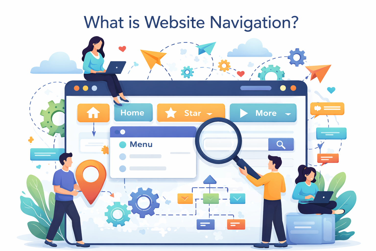
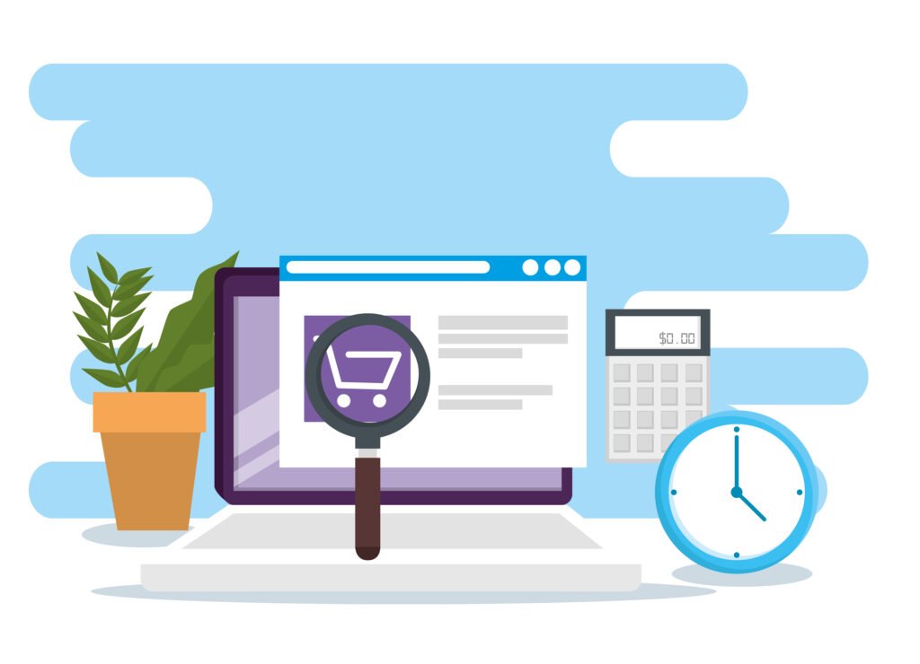
What is Website Navigation?
The digital road map of your website is its navigation. It’s a set of UI elements, such as menus, buttons, and links, that help them get from point A to point B. Its primary function is to enable users to find information fast and drive them toward a call-to-action, like purchasing a product or subscribing to a newsletter. Without a clear direction, users tend to get lost, and actually, poor website navigation causes 70% higher exit rates, or seven out of ten visitors leaving, if they can’t figure out where to go.
To understand how a website’s navigation is created, you have to first consider the construction of the site itself. Website navigation is not just a single horizontal bar located at the top of the page; it is made up of not only that, but your site header menu, search boxes, and breadcrumbs to display where someone has been on your site.
There are a variety of menu types available on websites. Here are a few examples:
- Horizontal Header Menus: This is likely the most frequently used type of menu found on websites today. It is a horizontal navigation menu located at the top of the page.
- Hamburger Menus: A three-horizontal-line navigation object that expands the menu when it is clicked. This is typically used for mobile devices because of limited screen size.
- Footer Menus: These menus are located at the bottom of websites and typically contain links to provide “extra” information, such as contact information, privacy policies, etc.
- Mega Menus: Large drop-down navigation menus that provide you with many categories at once and are more common in larger and more complex online retailers.
Usability in navigation is essential for SEO. This tells search engines which pages are the most important on your site, which assists in ranking your site higher while providing your users access and encouraging them to return to your site.
Types of Website Navigation
Selecting an appropriate layout is one of the most important steps in completing a design project. By 2026, e-commerce web navigation will have transitioned towards “intent-first” navigation design, which removes as many potential seconds of friction as possible. A significant benefit for mobile users is the hamburger menu option—which has the potential to increase mobile website navigation speed by 40% due to the decreased clutter on the screen and enabling the main body of content to load faster without excessive graphic noise.
Knowing different types of website navigation patterns in 2026 can help you select a menu that is specifically tailored to your business objectives. Following is a list of commonly used types of navigation (by frequency):
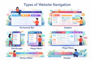
| Navigation Type | Best For | Pros | Cons |
| Horizontal Bar | Business sites & Portfolios | Familiar and easy to scan at the top. | Limited space for many links. |
| Sidebar | Dashboards & E-commerce | Great for long lists of categories. | Takes up side space on desktop. |
| Hamburger | Mobile-first & Minimalist | Saves massive screen space. | Hides links behind an extra click. |
| Mega Menu | Large E-commerce (Amazon) | Shows everything at a glance. | Can be overwhelming if not organized. |
| Sticky Menu | Long-form content & Blogs | Always visible while scrolling. | Can block small parts of the content. |
| Footer | All Websites | Perfect for “utility” links like Contact. | Often ignored by fast scrollers. |
Website Navigation Best Practices
In order to create a website that successfully converts visitors into customers, it is imperative to have more than just a list of links. The website must be based on an overall conversion strategy. The best navigation practices on websites, as we move towards 2026, are focused on creating a “frictionless” journey for visitors. Creating optimal navigation that is functioning correctly can enhance the number of conversions from your website by an average of 5.4% because it helps lead to the visitor spending more time on the site.
This article will provide you with a checklist of the steps that can help improve your site’s navigation for both SEO purposes and overall usability:
1.Start by designing the site map.
Before a designer actually creates any buttons on the website, they must plan what the information architecture (IA) will be for the site. A site map acts as a blueprint for a website’s content and how it should be organized in terms of logical categories.
The end result of using an IA is that any web page (or section of the web site) is able to be accessed within 3 clicks from the home page.
Use a hierarchical structure for your site map to help search engine spiders easily identify what pages are your “pillars” (most important) and which pages are supporting content.
2.The Five-to-Seven Rule of Thumb
The second principle of web navigation best practices 2026 is to limit your primary navigation menu to only five to seven items.
Why? Because it can be difficult for people to retain information about long lists in short-term memory; too many choices can cause “analysis paralysis,” making them leave without taking action.
Strategic Location: To capitalize on the Serial Position Effect, which suggests that people are more likely to remember the first and last items they see than any of the items in between, place your most crucial navigation links (such as “Shop” and “Services”) at the start or finish of your navigation bar.
3.Use descriptive and accurate labels.
Don’t be vague by using labels like “Products” or “What We Do.” Use specific labels to guide your users through both your site and Google.
Good: “SEO Services” or “Customer Relationship Management Software”
Why? Because Google will be able to understand exactly what your page is about, giving you a higher ranking in search results.
4.Add Visual Cues: Breadcrumbs and Calls to Action
Breadcrumbs: These are small, textual “paths” (e.g., Home > Men’s Shoes > Boots) that show your users exactly what page they are on. They are especially important for large, deep sites and greatly improve the experience of mobile users.
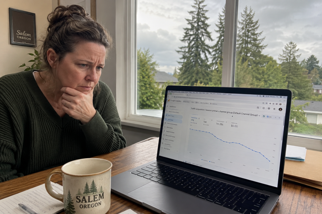
5.Performance Audit Through Analytics
Stop making assumptions about what works. Use these analytic tools to watch how your business is functioning.
- Google Analytics (GA4) “User Flow” report shows you where users are leaving your site.
- Reports from Hotjar or Microsoft Clarity give you heat maps showing the items in your navigation that users never use.
- Screaming Frog allows you to check your website for broken links and pages not linked in your navigation (“orphan” pages).
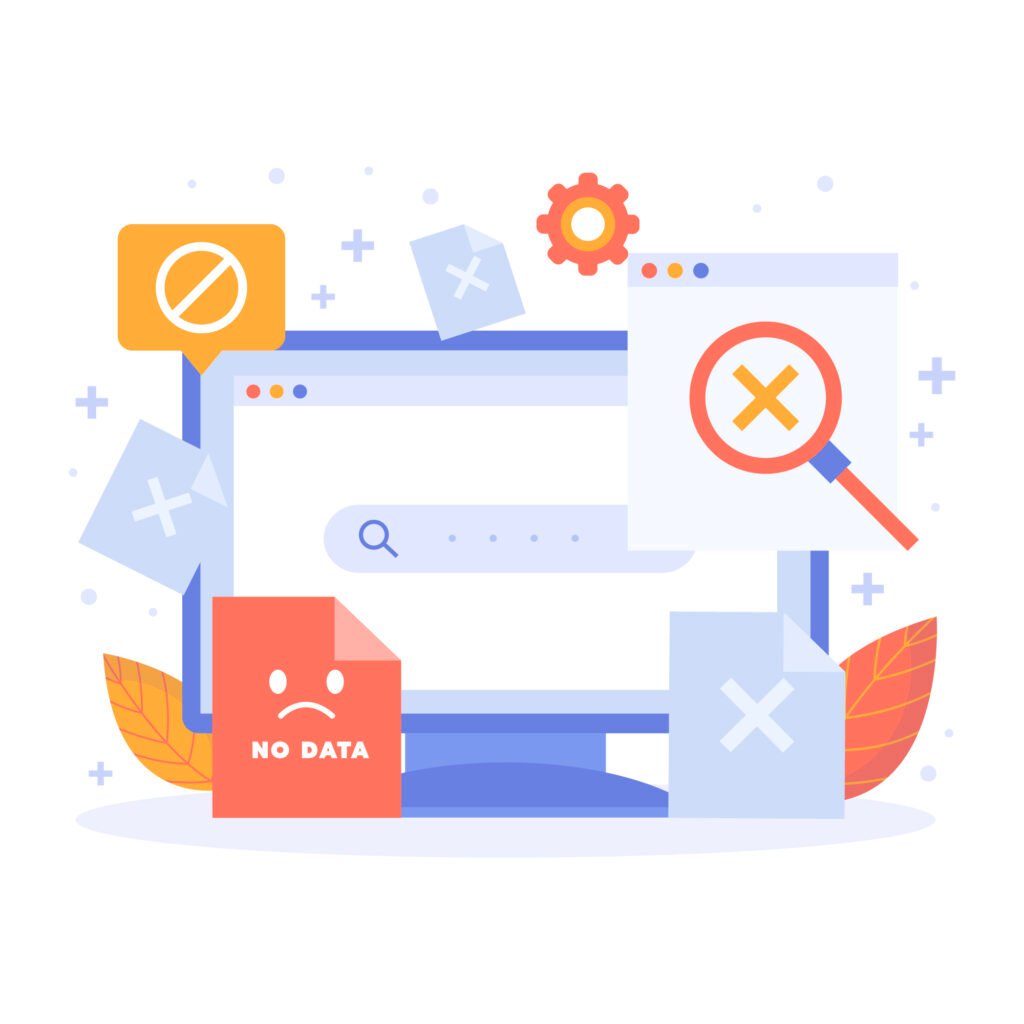
Common Website Navigation Errors
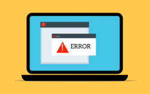
According to the U.S.-based analytics firm WHOIS, you will lose visitors if you have a visually appealing website but don’t make any small changes to enhance your navigation menus. The quickest way to reduce website bounce rates and keep visitors engaged with your website is to avoid making these common website navigation mistakes. For example, if your navigation menu is not mobile-responsive, this can double your bounce rate (you lose half of your visitors just because of your non-responsive menu).
3 major mistakes you must correct as soon as possible.
- Menu Overload: The top navigation bar contains too many links (i.e., 15). The number of links creates confusion due to visual clutter.
Solution: For websites with a large volume of content, you can use a “Mega Menu,” or you can move some secondary links, such as “Careers” or “Press,” to the footer of the website.
- Vague Links: The pages of a website are referred to by names that are not easily understood by a general audience (e.g., “The Lab” instead of “Services”).
Solution: Use straightforward, common language for your links. Using straightforward language will produce more clicks than using clever naming conventions to solve common website navigation errors.
- Ignoring the mobile experience: Although your desktop version of the navigation menu is designed to look beautiful, using a finger to tap the navigation links on a mobile device does not allow for easy interaction with the navigation menu.
Solution: Use a “hamburger menu” that displays large buttons with plenty of empty space around each button.
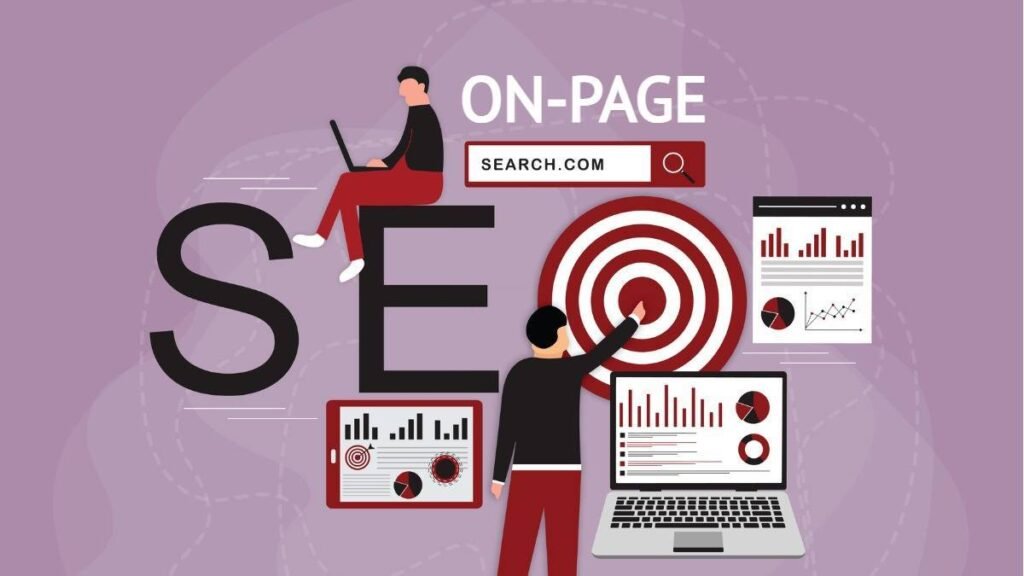
The Navigation of Your Website Impacts SEO

Navigation is more than just an element of your site used by end users; it’s also a way for search engine spiders to communicate with you. The Internet is continually evolving, and in 2026 there will be an even greater relationship between site structure and rankings. A well-structured website allows bots to easily find, crawl, and understand the hierarchy of pages, which results in improved rankings (up to a 25% increase) as a result of having the navigation properly structured for Search Engine Optimization.
1.Use descriptive labels for all navigation links.
The use of keyword-rich labels in your website’s navigation gives search engines instant context as to what each page is about. Instead of having a generic “Services” tab in your website’s navigation, for example, labeling it as “Cloud Computing Solutions” gives Google very specific direction as to what the page will contain.
- Internal Links – Each link in your main navigation (menu) contributes to your site’s overall link equity since it appears on every single page of your website. Because of this, they also imparts substantial “link equity” (or ranking power) to your most important content.
- Crawl Depth – Proper navigation helps ensure that your deepest pages are only 2-3 clicks from the homepage, preventing your deepest pages from becoming “orphaned” and, therefore, uncrawled/indicated.
2.Adjusting to AI & Updated Search Algorithms
Modern AI-powered search engines (like SGE) use Topical Authority as the primary criterion when ranking pages. A well-organized menu structure that categorizes content should group similar content into distinct clusters so that AI models have a clear understanding of your authority on a subject.
Intent – AI search considers how well your content fits a user’s journey path (e.g., from Guide to Pricing to Sign Up) so that you are more relevant for inclusion within AI-generated results.
3.Case Study: Impact of Navigation Improvement
a mid-sized e-commerce brand fixed its poor navigation labeling by switching from format-based navigation (i.e., “PDFs”) to descriptive, keyword-targeted navigation (i.e., “Photography Masterclass Guides”). As a result, the brand experienced:
- 20% more organic traffic in the first three months.
- 15% decrease in mobile device bounce rates.
- Higher rankings for previously hidden long-tail terms.
Mobile Website Navigation Tips
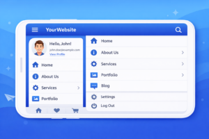
When it comes to mobile navigation, getting it right the first time is key (94% of mobile users will judge a website’s credibility based on its ease of use on a phone). If mobile navigation is difficult, users won’t only stop clicking through repeatedly — they’ll lose faith in the brand.
1.Learn to Use Your Thumb
As most people browse their phones with one hand, a mobile navigation menu should always place its key functions (`Search`, `Cart`, etc.) in the “Thumb Zone” (the bottom/middle of a touchscreen) where your thumb naturally rests.
Best Practices: Move your primary navigation bar to the bottom of the display screen, like Instagram and Spotify, making it easier to click with just your thumb.
2.Hamburger Menu Best Practices
Although hiding a menu saves a lot of real estate, it can also be very easy to overlook the menu. Here is a list of some key hamburger menu website navigation best practices:
- Label the Icon: By placing “Menu” next to the three lines, you can increase clicks by up to 20%.
- Keep It Simple: Make sure not to bury important pages in the hamburger menu. Use the hamburger for secondary links and always keep your main call-to-action button (e.g., “Call Now”) visible in the header.
3.Key Differences Between Mobile & Desktop
Your mobile flow is not just a smaller version of your desktop site. Your mobile flow should include a different set of logic.
| Feature | Desktop Flow | Mobile Flow |
| Interaction | Precise Mouse Clicks | Large Thumb Taps (Min. 44px) |
| Orientation | Landscape (Wide) | Portrait (Tall & Narrow) |
| Menu Style | Mega Menus / Hover Effects | Collapsible Lists / Swiping |
| Priority | Deep Research | Quick, Action-Oriented Tasks |
4.Use Sticky Elements
Sticky headers or footers remain in position as you scroll through a webpage. This allows you to always access the menu no matter how much larger the page gets. By making just one minor adjustment, you may significantly lower your mobile bounce rate by reducing the time it takes a visitor to find a page by about 30%.
5.Mobile Testing Tools
Do not rely on guessing how your website feels; use testing tools to assess how well your website performs on various screen sizes. For example, check out Google’s Mobile-Friendly Test, or try BrowserStack.
Conclusion
If you want to optimize your website navigation for growth, mastering your website navigation is key. By simplifying the user journey, you can reduce bounce rates, improve SEO rankings, and increase conversions. With trends in website navigation changing so fast, our main goal moving forward is to create a fast and well-designed experience for your users that works on any device.
Are you going to step it up a bit? Then Contact AGTC can help turn your website into a highly converting machine via web development services. Use Google Analytics to audit your website, test how mobile-responsive it is, and use at least three best practices from above to see some quick changes this week. Share this post with your friends or leave a comment below to join the discussion!
FAQ
What is the best website navigation menu design?
A horizontal top bar with 5–7 items is best for most sites, paired with a hamburger menu for mobile. For large e-commerce sites, use a Mega Menu to display categories visually without overwhelming the user.
How does website navigation affect SEO?
Keyword-rich website navigation helps search bots crawl your site and understand which pages are most important. Clean internal linking boosts your SEO rankings by keeping visitors on your site longer (improving dwell time).
Why is mobile website navigation important?
Since 60%+ of traffic is mobile, thumb-friendly designs are essential to prevent the 94% of bad first impressions caused by poor mobile menus. Use responsive breakpoints and large touch targets to cut your bounce rate in half.
What are common website navigation mistakes?
Overloading menus with too many links or using vague labels (like “Stuff”) confuses both users and search engines. You can fix bad website navigation issues by simplifying your menu to 7 items and adding a search bar.
How to improve website navigation for user experience?
Start by planning a logical sitemap and using breadcrumbs to show users their location. Organizing links by “User Intent” ensures visitors find what they need in three clicks or less, leading to higher conversion rates.
What tools help design website navigation?
Use Google Analytics to see where users drop off and Hotjar heatmaps to track where they click. For design, Figma is ideal for prototyping menus, while Ubersuggest helps find the best keywords for your labels.
Should website navigation include social links?
No—keep your header focused on conversions and move social icons to the footer. Distracting users with links that lead away from your site can hurt your sales and increase your bounce rate.


